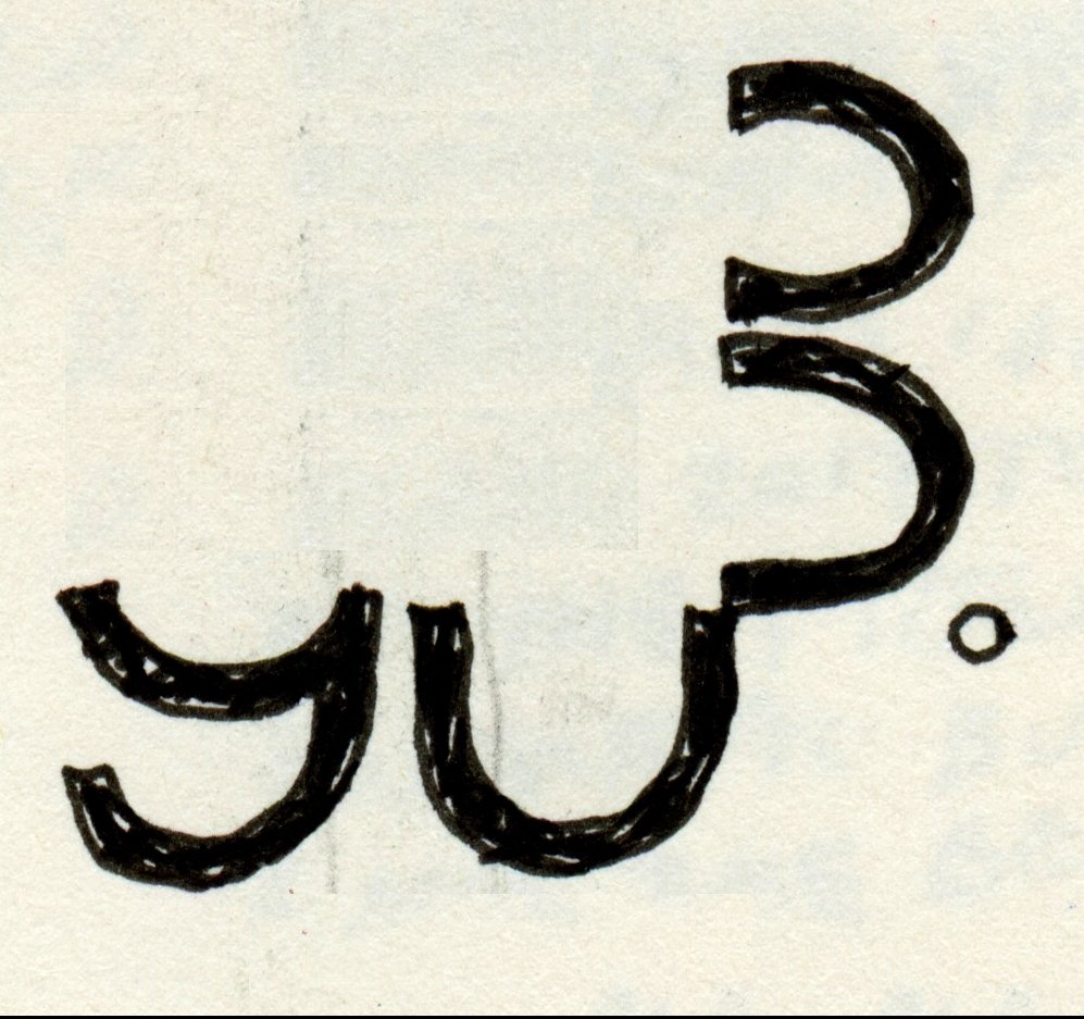
56Sharp
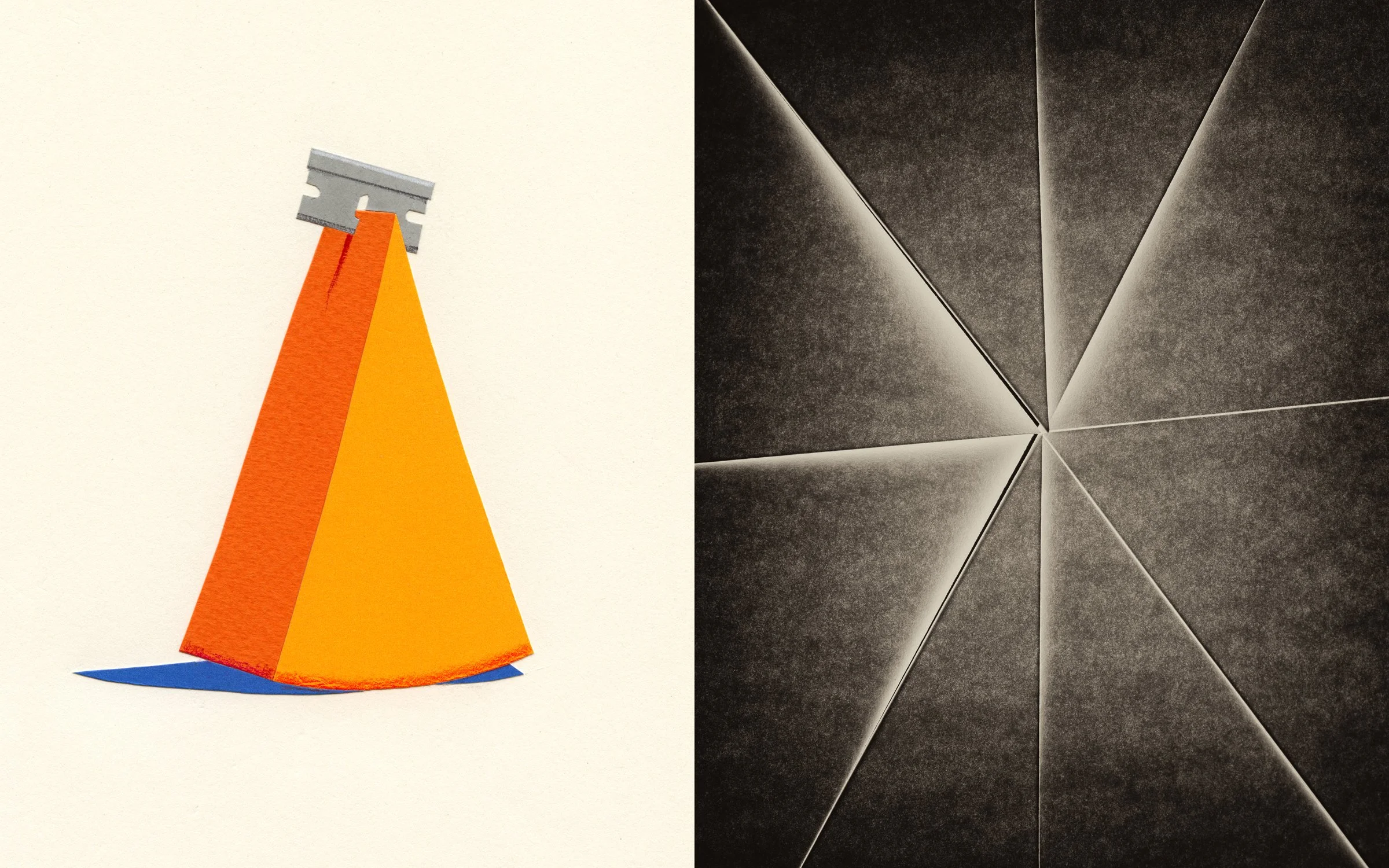
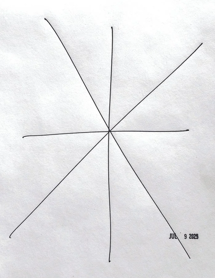
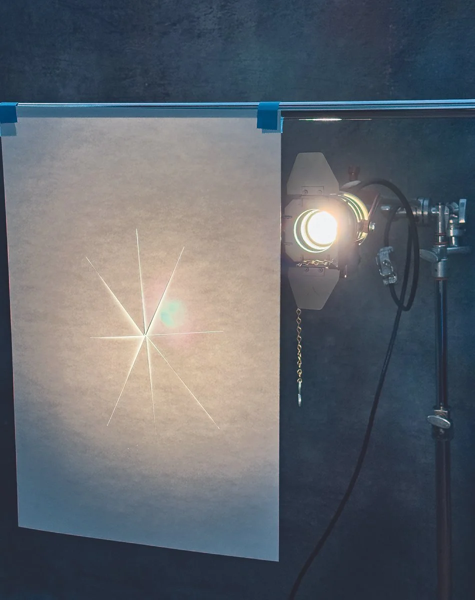
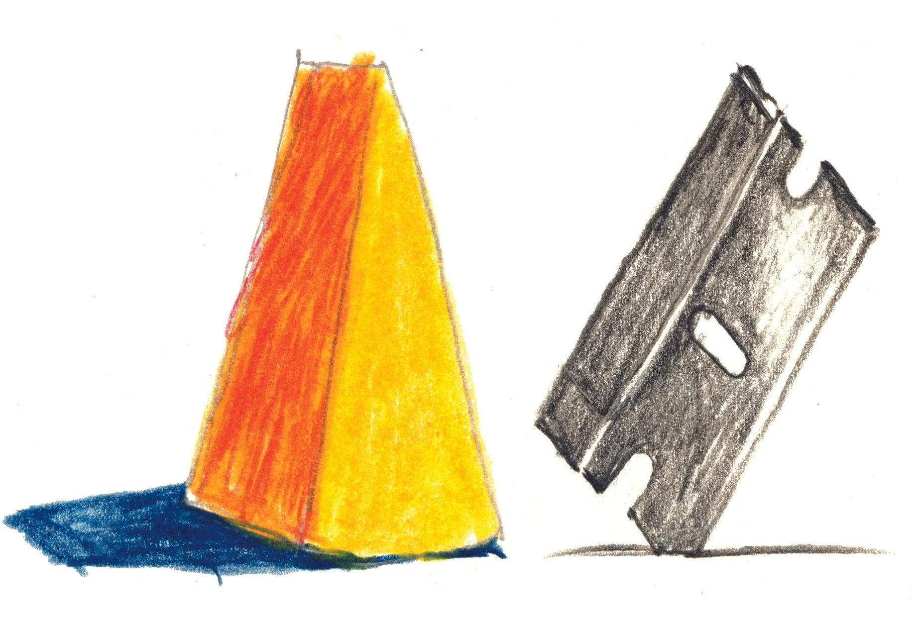

My first idea came from the hundreds of #11 Exacto blades I went through in art school. The rule was two cuts, then replace the blade. The second idea came to me in my sleep: cut a piece of paper with one singular center point and backlight it with one of my favorite lights, the “Mole-Richardson InBetweenie Solarspot.” It’s a simple Fresnel tungsten light that is no longer made. There is still something very sharp about tungsten light.
—cc
I looked at sharp knives, tongues, and the iconic single-edged razor blade. They all felt too obvious, but sharp cheese didn’t. It was sharp in taste and form. However, once I cut the cheese from paper, it fell flat. Fortunately, my earlier razor blade was the perfect foil—metal meets dairy.
—cf
55Rabbit


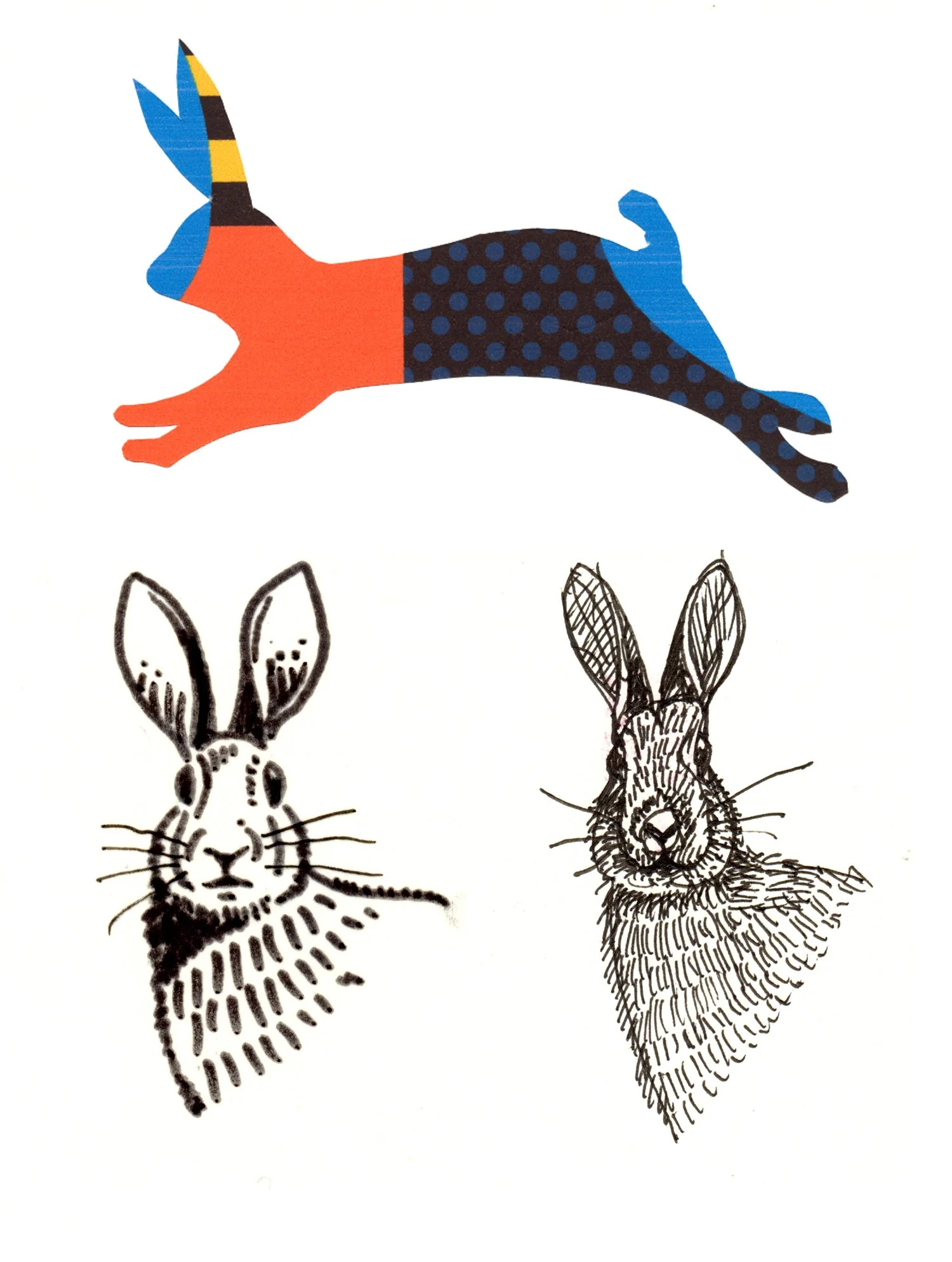

As a kid growing up in the ’70s, there was no such thing as cable and every home had one of these on top of their console televisions. Nicknamed “rabbit ears”, you would spin the antenna around trying to achieve a better picture which was always mediocre at best. It was definitely a skill that I was pretty good at.
I wasn’t thinking about trying to light this in anyway that would bring attention to it. In the case of the Archer Color Supreme 3, I just wanted to document it like a lost artifact from a past generation.
—cc
I love drawing a rabbit. Everything about a rabbit is fun—their ears, their tiny legs, their hop, their outstretched silhouette. All that said, I struggled to bring my rabbit up to 2C standard. there are tricks we can employ when we need to make things a little more interesting. I decided to perform a little trompe l'oeil—a drawing of a discarded drawing. Ideas are magic, one moment they are here, next they are gone!
—cf
54Blue


Pretty simple. I asked my favorite florist to create an organic arrangement by just using blue flowers with what she could find at the great LA flower market. —cc
Blue is a great word because it’s both a color and an emotional state. I sketched a blue tear and knew it needed to be presented in a more graphically interesting way. So I pixelated it by building it from 179 quarter-inch blue squares cut from PMS chips. A total value experiment.
—cf
53Saturated


I knew it had to be a sponge with a water splash. The concept was “how much water can a sponge hold?”
I enjoy creating still lifes with everyday common objects presented differently. —cc
I love color—especially saturated color. Perhaps my favorite—or at least most frequently used color—is red. Then it’s chrome yellow, then blue. A nod to the days of print and my favorite PMS color—032. I cut a supersized PMS chip from PMS paper—oozing color composed with the other two primary colors.
—cf
52Optimistic


With the onslaught of AI overwhelming every aspect of the creative world today, I wanted my photograph for the final word to be a timeless image that pays homage to the great photographers of the past. It had to be in B&W, it had to be a real studio still life composition, and it had to have grit. It also had to be an idea that I created without any guidance or influence from modern technology. Nothing is more rewarding or satisfying than using your own brain for ideas. Maybe I’m too “optimistic”, but for 52 weeks this has been the best creative challenge and a wake up call to me that this approach is still the best.
When I think of optimism I think of light. The sculpture I created is a metaphor for that. —cc
The great poster designer—David Lance Goines—once told me that if life gives you lemons, you make lemonade. At 21 years old, I didn’t really understand. By my 30’s, I started to get it. Making ideas is a matter of working with what you have—not what you don’t have. This pertains to talent, skill, money, encouragement, ambition—or lack thereof. To tap your best imagination, you have to be optimistic—to have the blind belief in endless possibilities. If you think otherwise, it’s game over. This project has been all about that.
—cf
51Pedal
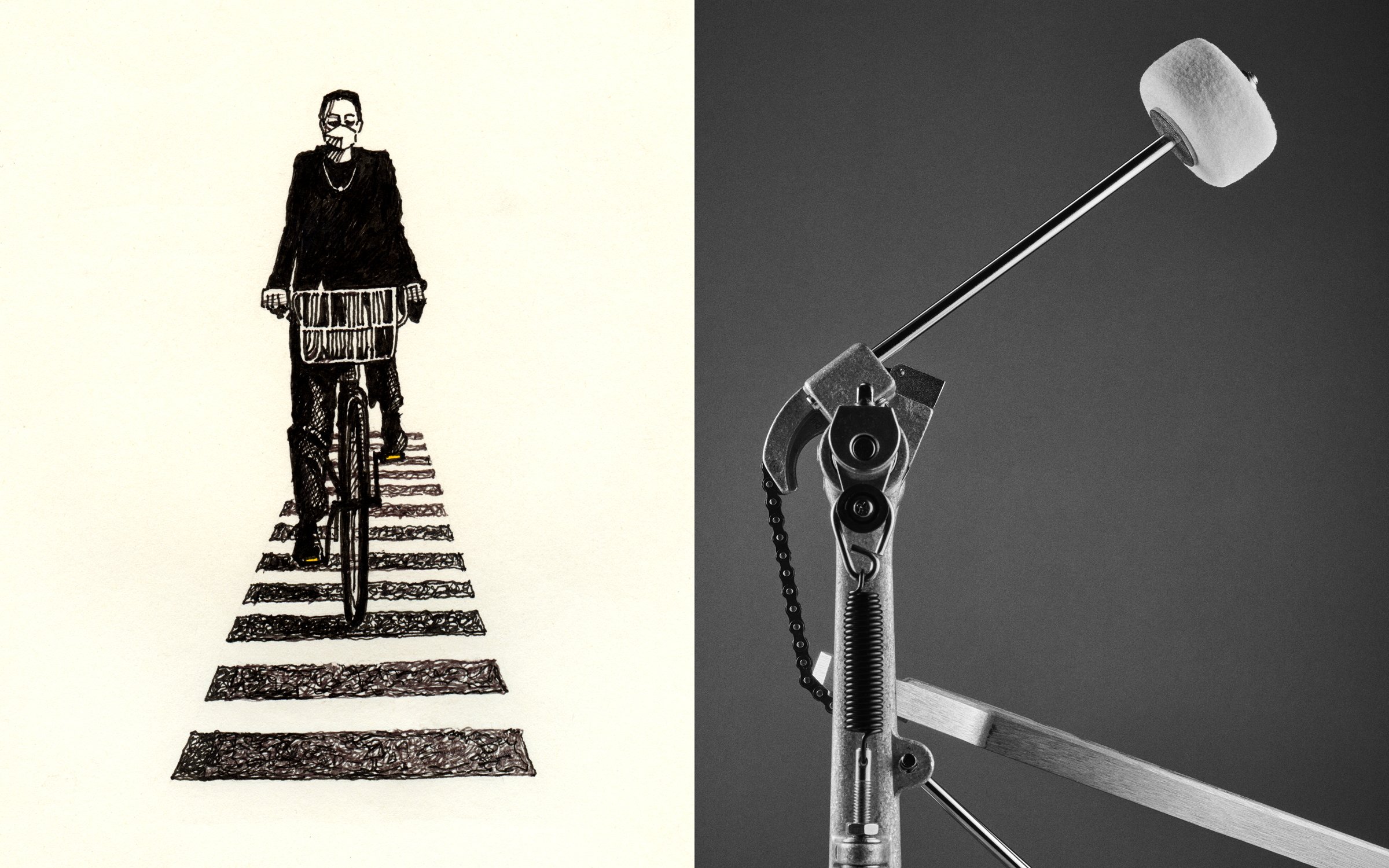


To come. —cc
I love photographing bikes and their riders in different countries—then sketching them. I frequently don’t see peculiarities until I draw them. I chose to draw this cyclist I photographed in Tokyo last year. Dressed entirely in gray and black, with a mask—heading straight at me in the crosswalk—her tire but a vertical blade. When I drew her I discovered that in her basket was a bolt of Marimekko fabric with its stripes running perpendicular to the stripes of the crosswalk. There was not a spot of color except for the two orange reflectors on the pedals. She was graphically perfect.
—cf
50Two


To come. —cc
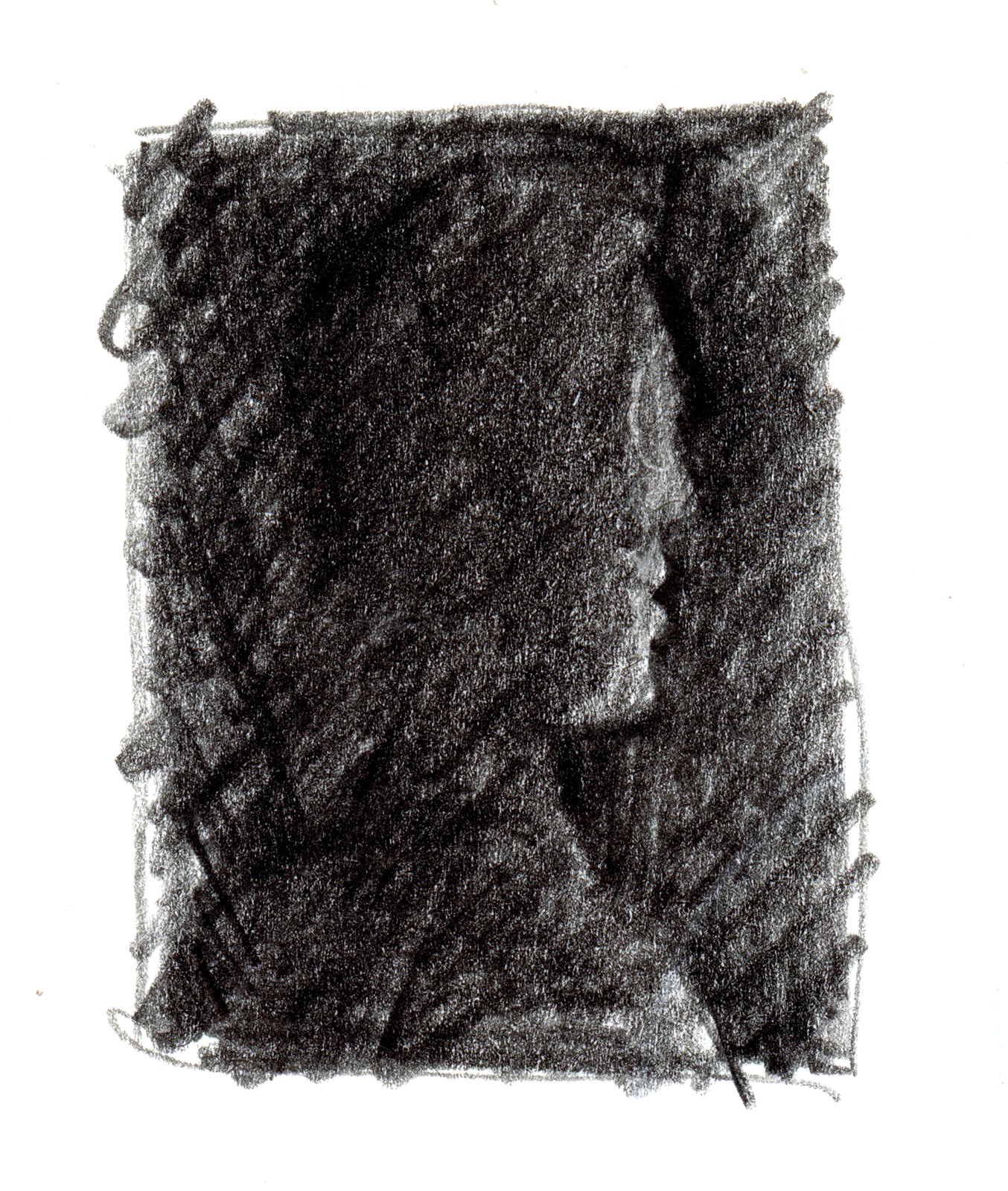
Dominoes and dice are beautiful counting systems based on a language of dots. Their simple, and exact arrangements make them instantly communicate a value without actually counting each dot. Both are graphically perfect. I ultimately chose the domino because it says so much with so little. I cut it out of paper and was left with four pieces in total. By including the extracted holes and line in the composition, we are given permission to see the domino in an entirely new landscape. You’re welcome.
—cf
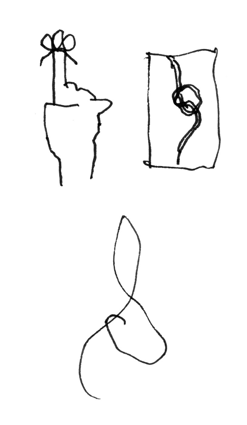
49Strength


We both often have unannounced ideas that we never present. In this case, CC showed CF an idea (the knot) so CF came back with an idea that lives comfortably aside it.


I knew I was traveling to Boston to visit my daughter and I would be searching rather than creating a solution for this week’s word.
Fortunately I found a statue of George Washington mounted on his horse looking very much in command over a stormy sky inside the Public Gardens Park next to my hotel. The statue was commissioned to Thomas Ball in 1859 and was dedicated in the park in 1869. The monument was conceived in an effort to present Massachusetts as an artistic center.
I was happy to find a location rather than a still life for a change. I don’t like to specialize. This probably goes back to an interview just out of college in NYC and the creative director told me I would never make it unless I focused on one genre. Why would anyone want to do that? —cc
My diagrammatic tendencies led me to attempt to create a demonstration of unexpected strength. Once again, I returned to the egg! In a battle for strength over size, the egg is a heavyweight. In scientific terms, it has enormous ‘compressive strength’—the degree to which an object can withstand force before breaking. I wanted to make a drawing that showed that and was graphically compelling at the same time. A tiny egg vs. a 50 lb. cinder block was the sublime demo—and fun to draw! In its vertical position, the mere chicken egg can support between 100 and 300 lbs. before failing. This is due to its shell’s distribution of weight. Let’s hear it for the mighty egg!
—cf
48Iconic


When I hear the word “iconic” I first think of timeless pieces in industrial design and furniture design. I could have come up with 15 more items to shoot but I thought these three were quintessential works of art that best represented iconic design.
Here are a few of my favorites…
1. The Hasselblad 503CX film camera was released in 1988 and is still one of my favorite cameras. Not until you cradle one in your hand will you truly understand why it is a masterpiece of industrial design.
2. The Braun travel alarm. Designed by Rams and Lubs in the 1970’s. The clock has a clean minimalist design with a focus on functionality. Personally I much rather wake up to this than my iPhone.
3. Finally, the classic side table designed by Eero Saarinen in 1956 with an iron tulip base creates the perfect shape complimented with the simple white marble top. I wake up every morning to seeing this table.
Simple design will always remain iconic. I have always said that simplicity is the hardest thing to create. —cc
This week’s word has points right to design for me. My mind was instantly flooded with objects, furniture, and products that are iconic in terms of their 1) cultural status and their 2) graphic representation. I’m attracted to the both everyday objects that have lasted (paper clip) and legendary design forms (Eames plywood chair). Graphic design makes great visuals out of product and object forms that are timeless (Coke bottle) Proof that a good icon can be represented in one solid color with minimal detail. Testing my theory, I took a fat brush pen and attempted to render a full page of icons that came to mind. Most of them made the cut—except Dylan—I’m not going to compete with Milton!
—cf
47Effervescent


I had every intention of shooting moving bubbles in a glass but once I added a spoon everything changed. The spoon became engulfed in bubbles like a jewel.
On many of the most recent “words,” I have spent more time thinking of ideas and spent a very short time on the actual execution.
The core of this project is all about learning how to think again, it is all about creating concepts on your own. This is also my favorite part of our project. The visual is secondary to coming up with a solution. —cc
7-up came instantly to mind—almost sickening bubbly. The original bottle design brilliantly said effervescent with the depiction of 7 ascending bubbles. I paid homage to its brilliance by doing a cut-paper version of a small crop to show just how memorably iconic it is. Simple, smart, elegant.
—cf
46Thick


The deeper we go into this project, the harder I want it to discover the word. This week’s tools was just a single mirror and a bottle of honey. One hand poured the honey and the other hand fired the camera. Some times the smallest production creates the best results. What a relief not to have any client feedback. I also like that my image created a face. —cc
Thick as a brick, thick skulled—first ideas. We have honey bees and there’s something about the slow drip of thick honey. I saw no other way than to faithfully draw the the nuances of sticky, slow honey—which is all about how the light is transmitted through the liquid amber.
—cf
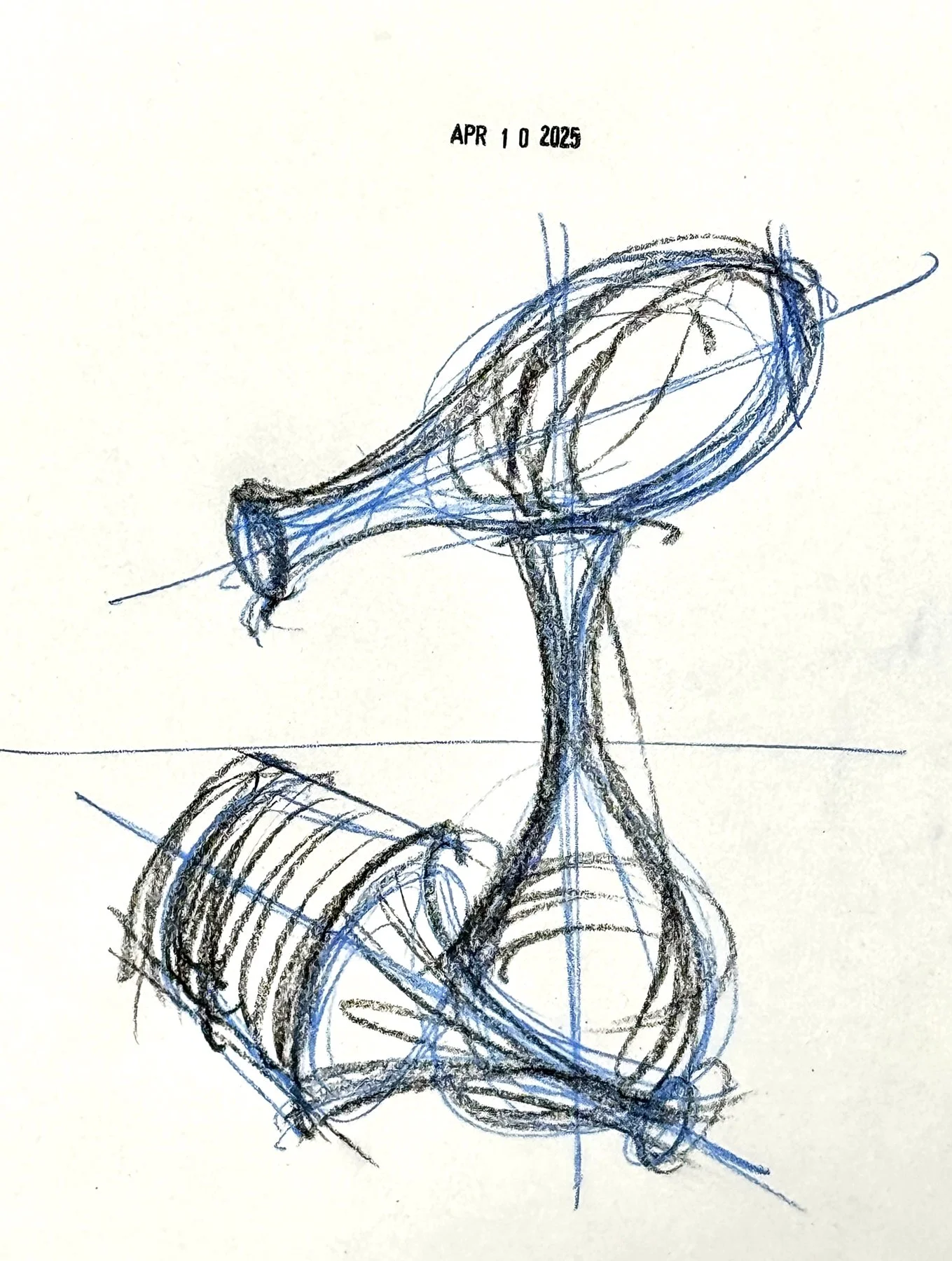
45Vessel


When I saw that this week’s word was “vessel” I first thought of the great Irving Penn who created a brilliant show at the Pace/ Macgill Gallery in 2008 based on vessels. Any attempt to come close to achieving his masterful work on this word comes sufficiently short. —cc
I sketched several simple Japanese vases and hastily committed to one in pen and ink. Dissatisfied, I Googled ancient Greek and Roman urns to discover their sensuous silhouettes—much like little figures. I cut 9 of them from some scrap marbleized paper that my wife had made—I suppose giving a nod to their fluid contents. Each one a satisfying surprise.
—cf
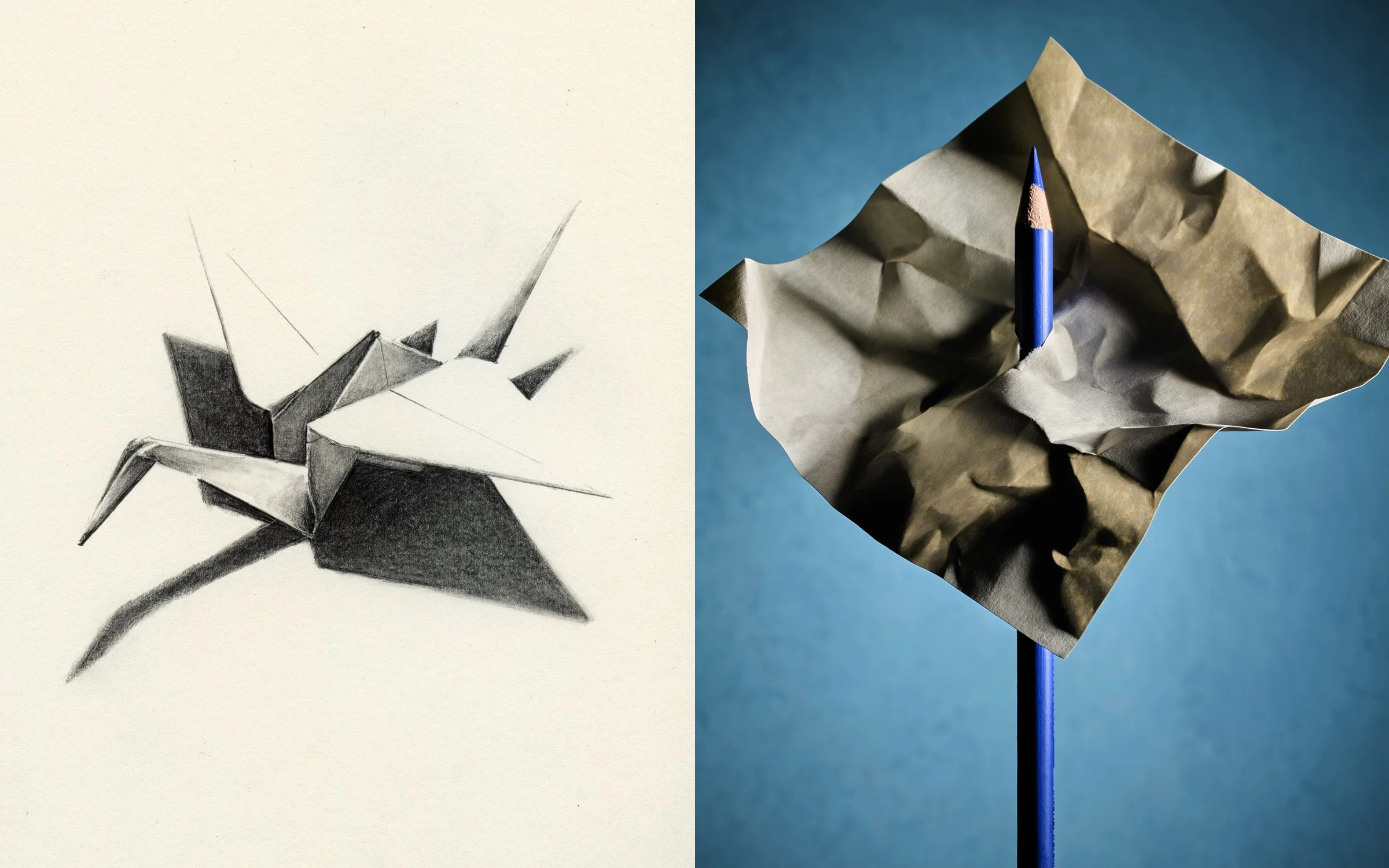
44Macro


A macro image is something that the human eye cannot see. It allows you to go to a place that can only be found using a macro lens. It is here you get to see things differently. —cc
I immediately thought of close-up scientific photographs of bugs! Drawing from nature seemed the right path—maybe a nod to Audubon and the naturalist illustrators. Just by coincidence, a week ago, I had photographed the tiny trillium just opening on our morning hike. My drawing is about 6x actual size. I was also thinking of the sublime flower drawings of Ellsworth Kelly that say so much with so little.
—cf
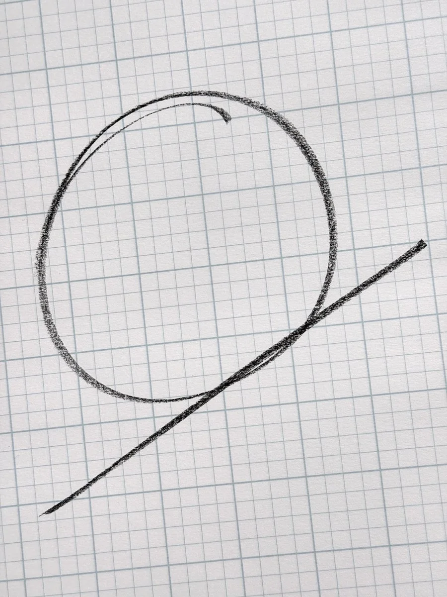
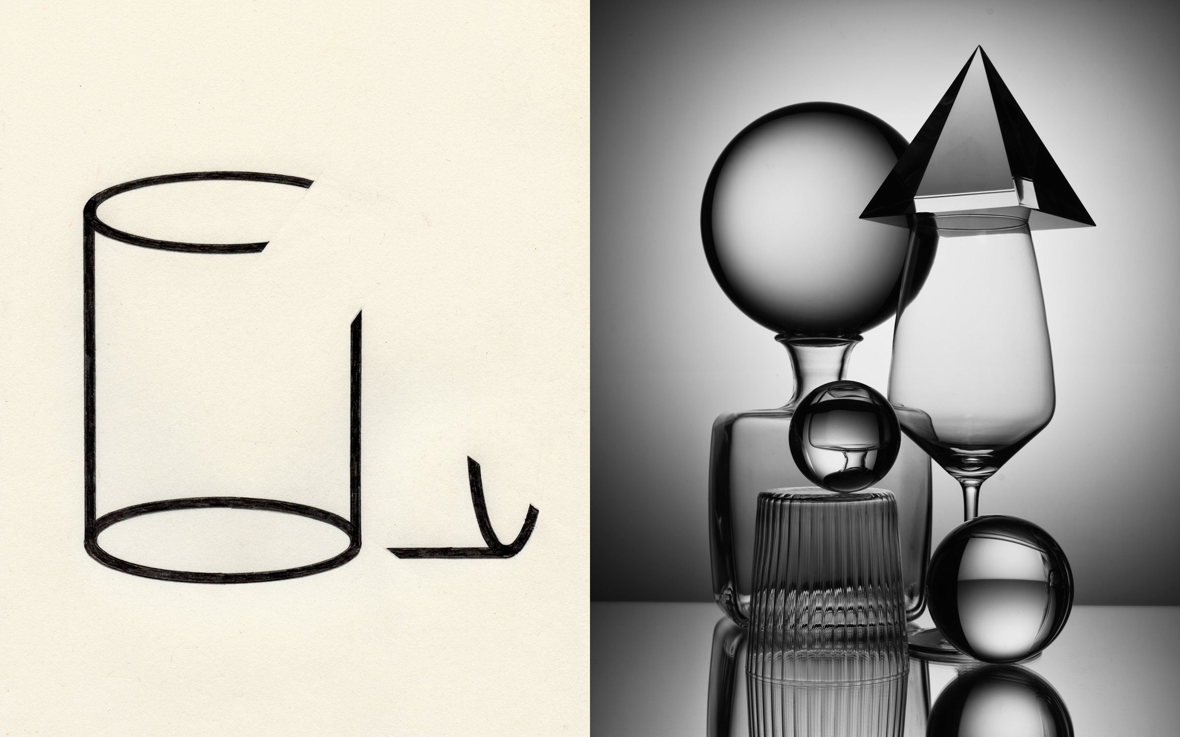
43Intersection


One of my all time favorite classes growing up was geometry. Probably because you got to draw all kinds of circles, squares, and triangles. Little did I know that I would carry these skills into my future.
This week’s photograph represents a line-sphere intersection. —cc
I initially drew the classic form of two colliding planes. It’s a beautiful graphic expression, especially how I drew it—very ‘80s. Seemed a little thin, so I changed the planes to figures. Now there’s a conversation.
—cf
42Puncture
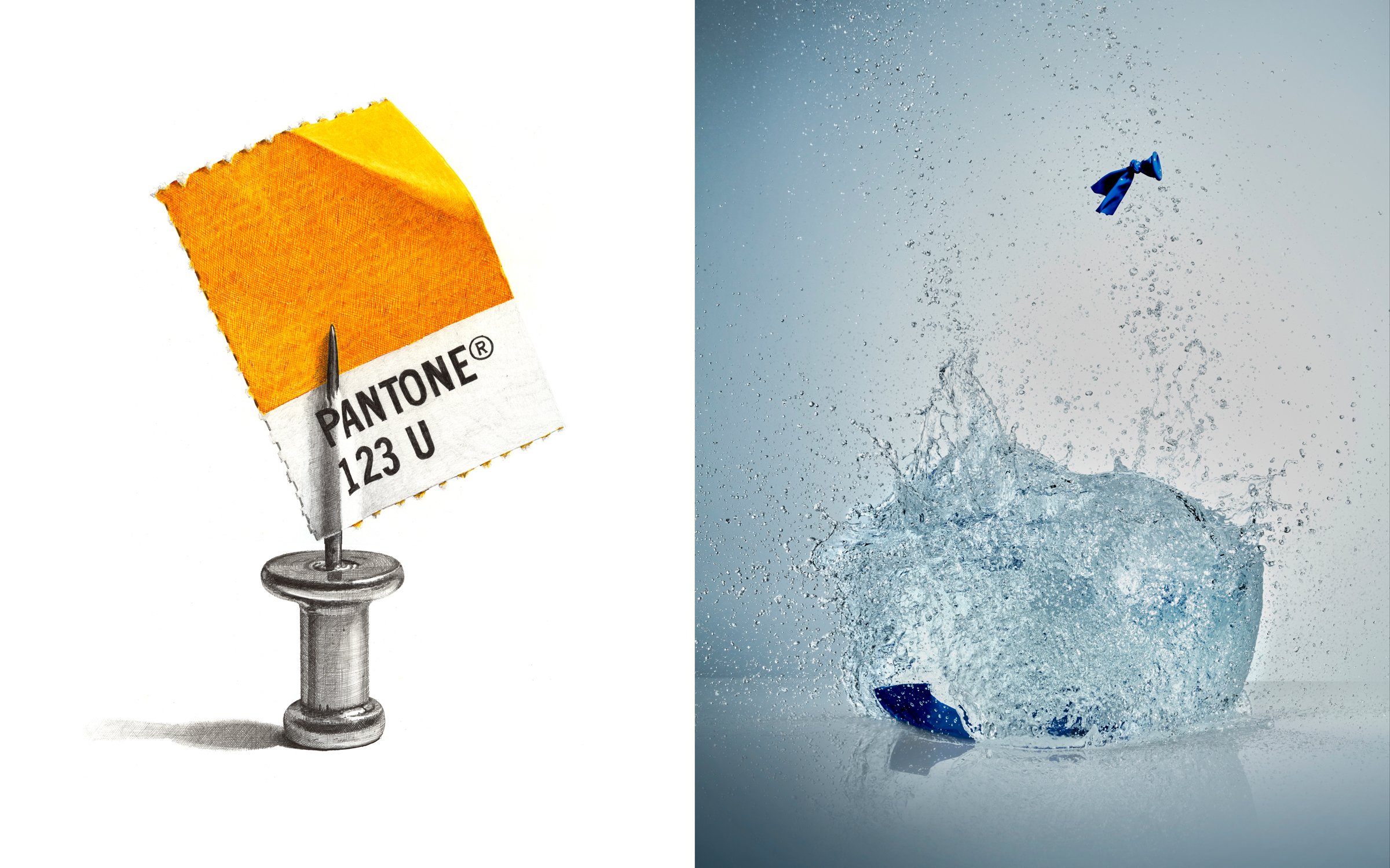


This was an exercise in perseverance. Puncturing a water balloon and capturing the moment it explodes with a strobe light that has a duration of 10,000 of a second creates the most unexpected images.
This captured art only exists in the moment of destruction and cannot be seen by the human eye. It is also a lot of fun to do. —cc
My studio is full of sharp devices—all capable of puncturing something. I played with a trick showing the exit in an odd place relative to the entrance of the pierce. Ultimately, I settled on an unlikely encounter of two of my favorite objects—a pushpin and a PMS chip. Together they created a heroic monument to design. Super fun to draw!
—cf
41Focus


To come —cc
Focus is all about visual clarity—things are ‘in’ focus or ‘out’. I started by drawing a simple pictogram and attempted to throw part of it ‘out’ and part of it ‘in’.
—cf
40Quiet


I was having flashbacks of being a young alter boy and what I remember the most was the quietness in the church once I extinguished the candles on the alter. —cc
I initially drew the person in the boat quietly floating under the moonlight. As often happens, when I finish an idea, I get freed up to think about the problem differently, as I did here.
Some words come with metaphors we all use to explain them—quiet is one of those words. So quiet, you could…
The drawing itself is quiet as we see the pin in the last moment of silence.
—cf
39Fast


The obvious solution would have been to photograph a scene with some sort of motion blur.
Obvious solutions are usually predictable and boring so I went a different direction. The 356 is a quintessential nod to this week’s word.
—cc
We had two whippets and they personified fast. They had two speeds—38mph and sleeping. Their elegant bodies are made to cut the air. This is jet black Tenacity, barely touching down.
—cf
38Note


Strong concepts with simple solutions. This is my favorite genre. Taking objects out of context to create new ideas.
Paper, shapes, and shadows all working together.
—cc
I contemplated a musical note, but only momentarily—it’s not my favorite note.
I live by notes—be them postits, sketchbooks, or a list on scratch paper (which I make daily). They are all designed to free up space for the mind to wander. The more notes—the more need for notes. My biggest problem is remembering where I left that note.
—cf
37Box


Part 1. The stack. I always wanted to be an artist who could create sculptures out of random stuff so this was my attempt at building a temporary sculpture using cardboard boxes.
Part 2.The crushed stack removal. This is self-explanatory.
Part 3. The film box. In the film industry, the apple box is an essential tool used on most photo shoots. Every key grip, best boy, and assistant must know the rule of its sides.
Side one is the lowest, side two is the middle height, and side three is the tallest.
This week’s image is more of a lesson —and less of a still life—that demonstrates two out of the three sides.
I stacked the four apple boxes and used the natural studio sky light for this one. Probably the fastest word to shoot. 10 minutes total.
—cc
I couldn’t get the idea of opening a box out of my mind. My first two attempts contained odd contents—a figure (holding a box) and a pile of snakes. They were OK but neither felt particularly beautiful. When I get stuck, I just look around my studio. The box was the problem! So I drew a shaker box that was a gift from my daughter filled with beach rocks gathered with my son (also used in 14/52). A literal depiction of the idiom “a box of rocks.” Hopefully not a dumb drawing.
—cf
36Feather


One of my favorite places to explore is The Hall of Birds room at The Natural History Museum of LA County. As soon as I got this week’s word, I knew I had to shoot here. —cc
A feather is like a piece of calligraphy, so it’s hard not to want to draw it in all its beauty. My first drawing (blue feather) married the feather’s silhouette with it’s purpose. I liked the concept but felt it was missing much of the feather’s intrinsic detail, so I drew one more paying homage to its birthplace—and 3/52.
—cf
35Utensils


The only thing better than shooting with a 4x5 view camera is shooting with a 8x10 view camera.
The film grain from a 8x10 tri-x negative will never be surpassed by a digital file. —cc
These are the essential utensils of my job—and have been for 50 years. They are all handheld. I draw almost exclusively with a Micron .01 pen, I cut with an Exacto Gripster knife with #11 blades. I use several brands of colored pencils, but my years as a designer has given me a great affinity for Prismacolors. I use all kinds of graphite pencils, in this case, a Berol 2H and a Blackwing. Blue painter’s tape are amongst the many tapes I use. I like Moleskine sketchbooks but the last several years I have been using archival Japanese Top Drawer sketchbooks (shown) because the binding provides for laying flat.
—cf
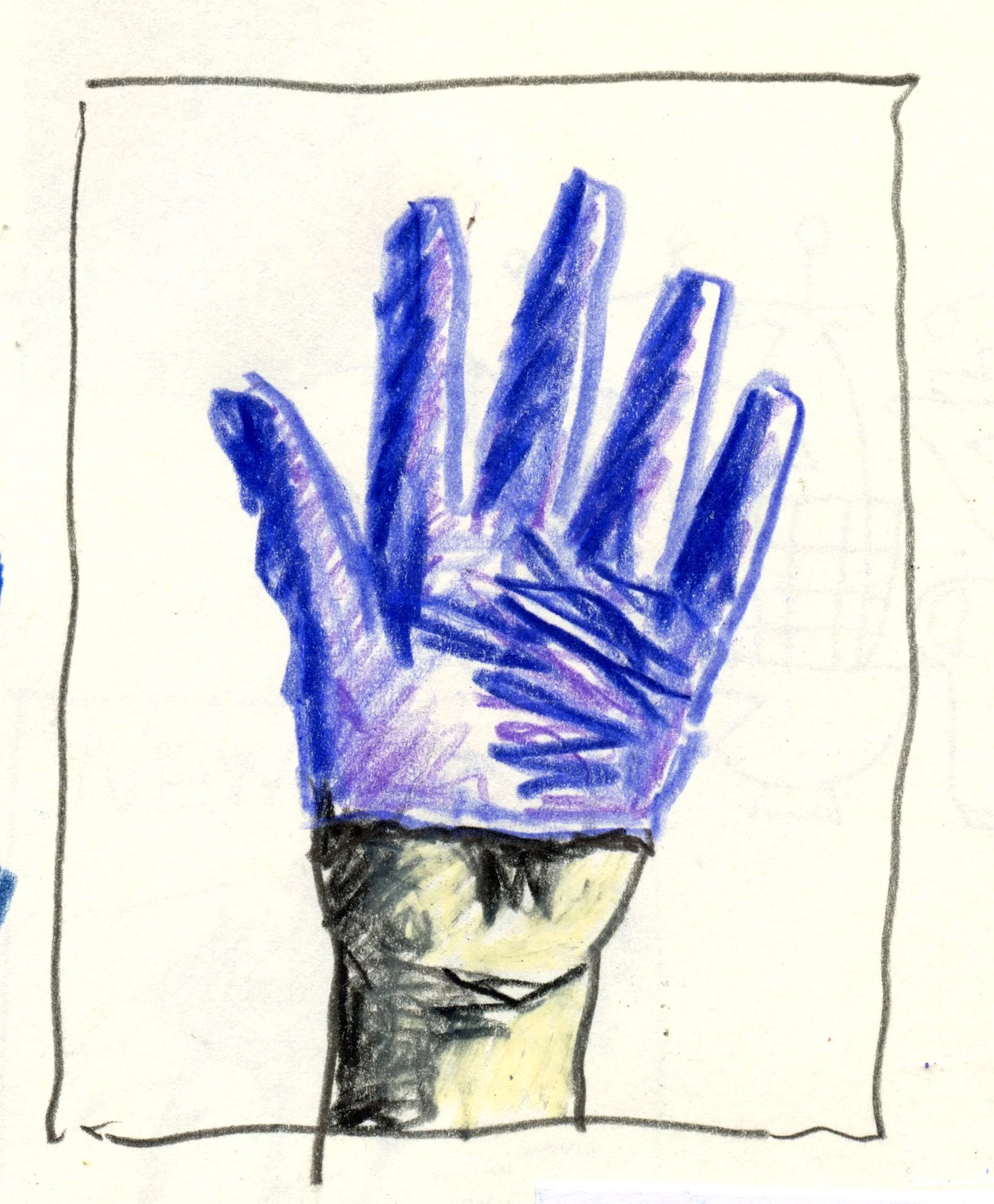
34Tight


I wanted to create a brutalist sculpture using two blocks of steel inside a C clamp. I always found tools to be very inspirational when creating still life photographs.
I was also inspired by Walker Evans B&W photographic series of individual tools he created over a century ago. —cc
Adjectives are tough. I have to represent a certain feeling. I initially thought of things like a tight situation or tightening a bolt. It’s kind of mechanical. I pulled on a surgical glove as they are always too tight. Sure enough, if I didn’t put it on all the way, it exaggerated the tightness. It was fun to draw with colored pencils—a homage to Craig’s red hand (28/52).
—cf
33Fruit


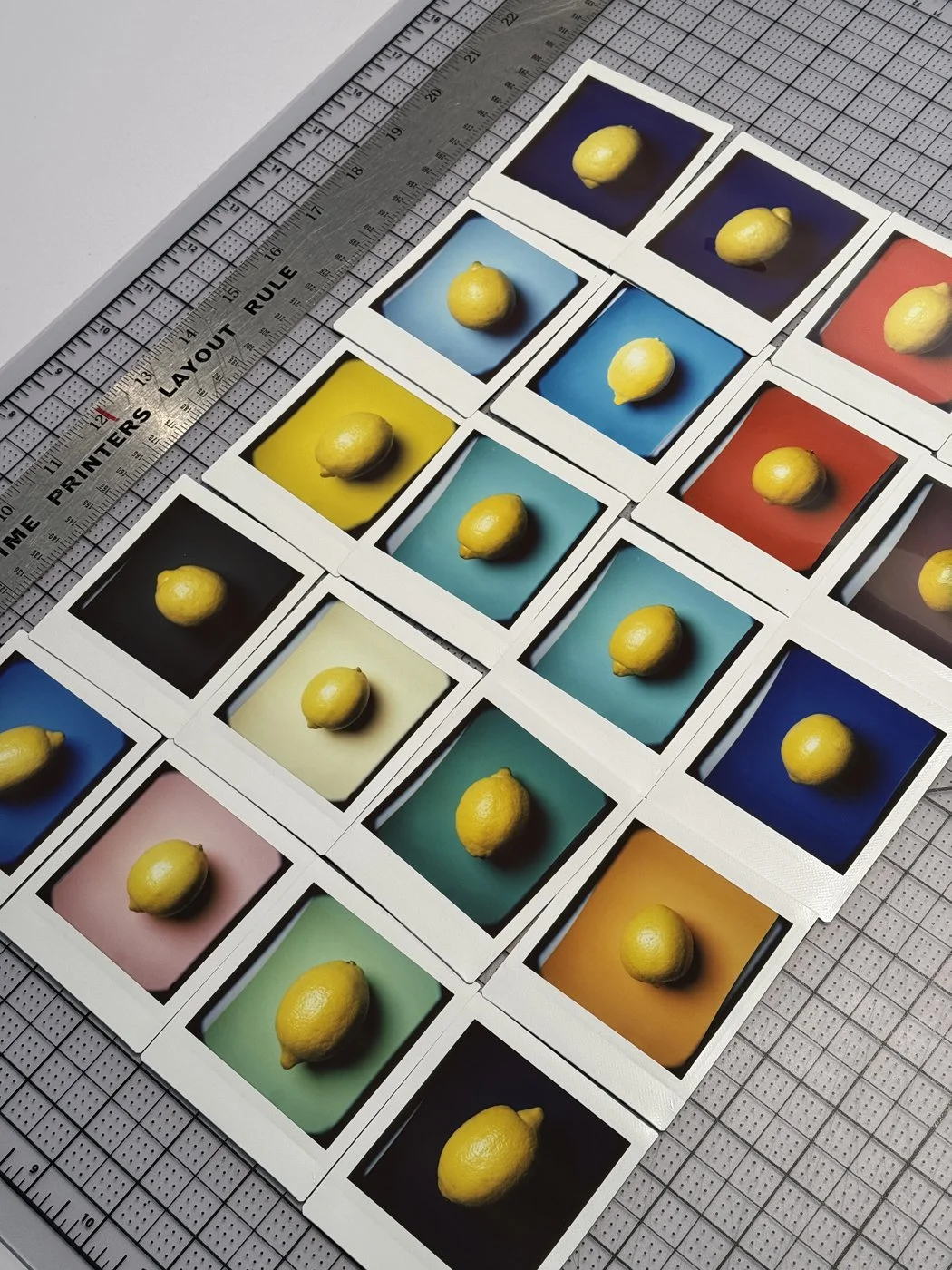


When we started this project, we both agreed that the format would be a 4x5 proportion. I have spent much of my career shooting with 8x10 and 4x5 view cameras so l thought this word was appropriate to introduce that camera to the party.
My idea was to use the actual 4x5 film’s edge as a creative tool that would contain the lemons. Once the image was shot I sent the film off to The Icon Film Lab to process and create a drum scan.
The film’s edge is just as important, if not more than the actual objects in the image. —cc
I’ve been trying to do these quickly to see what initial ideas look like—not over-thinking. I looked up from my bowl of cereal and spotted a lemon in a bowl. Ah, a simple fruit. I instantly drew it laying inside a martini glass. While photographing my idea, I discovered that the composition was more interesting with the glass inverted.
At this point, the challenge was only executional. The first drawing was a faithfull rendition in graphite and colored pencil. The second was a graphic trick of pixelizing the lemon. The martini was drawn as if a public symbol for a bar.
—cf
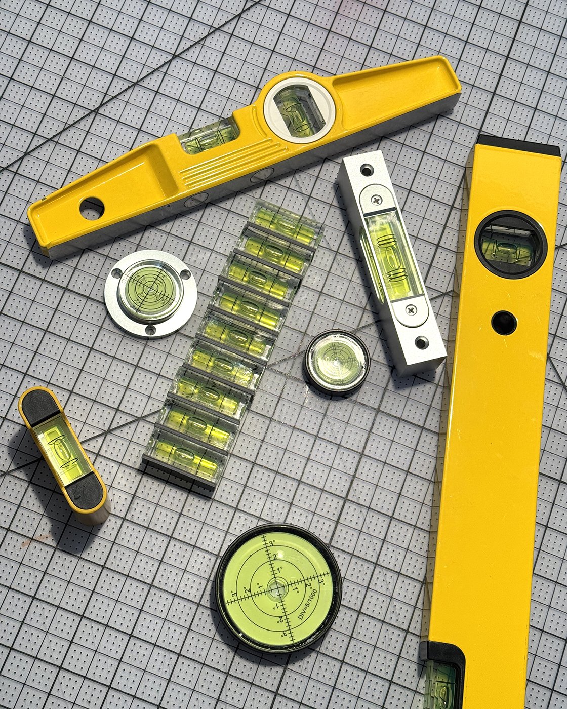
32Level

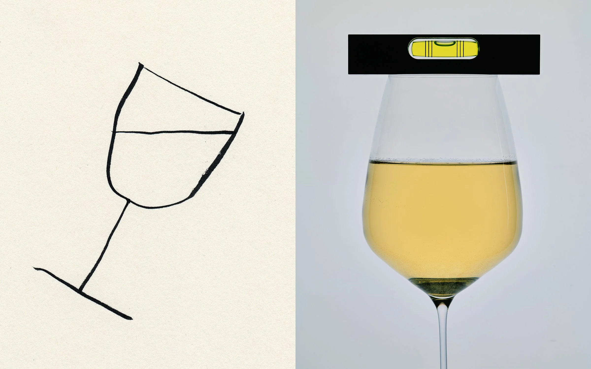
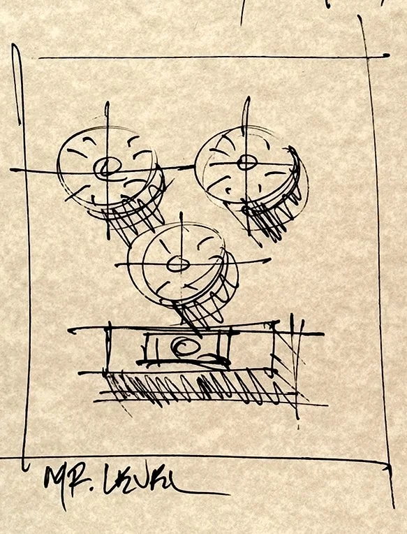
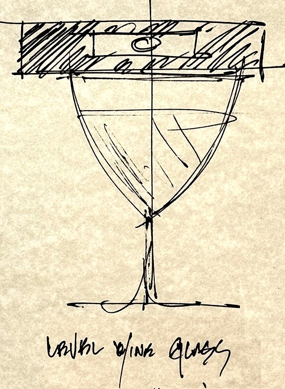

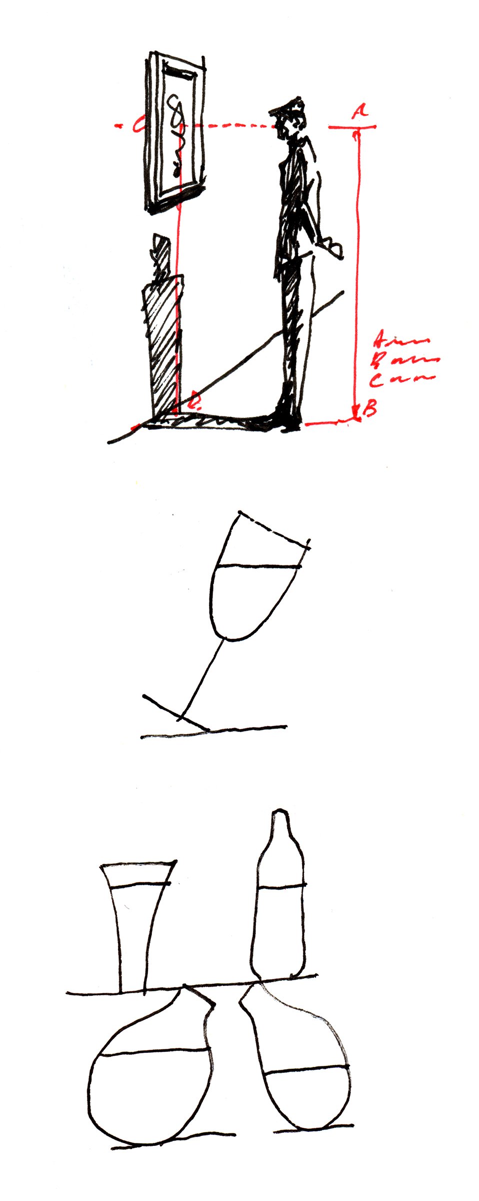
Irving Penn was the master of the still life face. I used this week’s word to pay homage to this great photographer.
Photographers are obsessed with keeping things level. —cc
I like diagrams, particularly scientific. Level is an absolute fact and lends itself to a mathematical diagram. I also love drawing spectators in museums—so the combination provides and opportunity to explain “eye-level.”
I was sure this was the perfect solution until I texted Craig requesting he send me his “level.” His reply was “the only thing level here is my wine glass.” I immediately saw a new solution and dashed it into my sketchbook. Unknowingly he had a somewhat similar vision!.
—cf
31Dark


Through my many years of photographic assignments there would be times when the main light would misfire resulting in the subject becoming a silhouette. These accidents create images that you never expect and in many cases are even better than what you originally planned. This was my inspiration for dark. —cc
Since Craig did a self-portrait (25/52), I thought maybe this was a good reason for me to do one. I took an iPhone photo with a single light and drew it in graphite. I kept darkening out information until the bare minimum remained.
—cf
30Cold


This week was a simple combination formula. Art + Cold = Concept. The paint brush represents art and the ice represents cold.
Then it was just a waiting game before ice melted away from the bristles to create the shot. —cc
There were a lot of possibilities for cold. Things and events that are only cold. It came down to the “twin Pop” that was so much a part of my childhood summers. I knew it would be fun to draw—basically from memory. I drew it a few ways, highly rendered in graphite and a single line brush drawing—both work. (see Gallery page)
—cf
29Dream


My idea was simple—I wanted a dream portrait. I knew it would be dark with closed eyes. I wanted a portrait from within the mind. The set was silent, the camera did not make a sound, and there was very little light. My subject never knew when the picture was taken. —cc
Dreams are about seeing in your mind’s eye. Our eyes have to be wide open while they are shut. It’s a state of being, a place you go. The word asked for an impossible reality. I can’t explain the drawing, but it’s really simple.
—cf
28Red


My original idea was to create a still life covering blocks and spheres with red pastels but everything changed when I spotted a gallon jug of red acrylic paint at the art store. Dipping my hand into a bucket of paint was the easy part. The hard part was triggering the camera with my other hand. —cc
Probably the most used color in my design career—possibly the most beautiful and powerful color. I had just sketched an idea (book and letters) and rather than use multi-colored letters, I decided to solve this problem by coloring it entirely in red. The accidental bonus was the other “read”.
—cf
27Folded


I like creating images with basic materials. I had this image in my head of a suspended folded piece of paper. I used one Exacto knife, one piece of watercolor paper, and one straight edge, always cutting half the paper on the outside bend and one more thing, one light. —cc
My mind inextricably connects folds to paper. Still under the influence of Japan—I was thinking utmost simplicity. I made a couple of sketches then a folded model, cut the segments from PMS colored papers, and pasted in my sketchbook. —cf
26Shatter


Throughout my career I have shattered everything from light bulbs to crystal, but always as a photographic still life.
A shattered self-portrait seemed more interesting to me so I didn’t think twice about smashing a mirror at the studio to capture this one. —cc
My wife and I were traveling in Japan when this word got assigned. I was seeing a lot of sake vessels and their silhouettes were always striking in simplicity—inspiration supplied. In order to know something is shattered, you have to know what it was whole. —cf
25Wind


I thought it would be easy to find a blowing Turkish flag while traveling on vacation with my wife—but finding is a lot harder than creating.
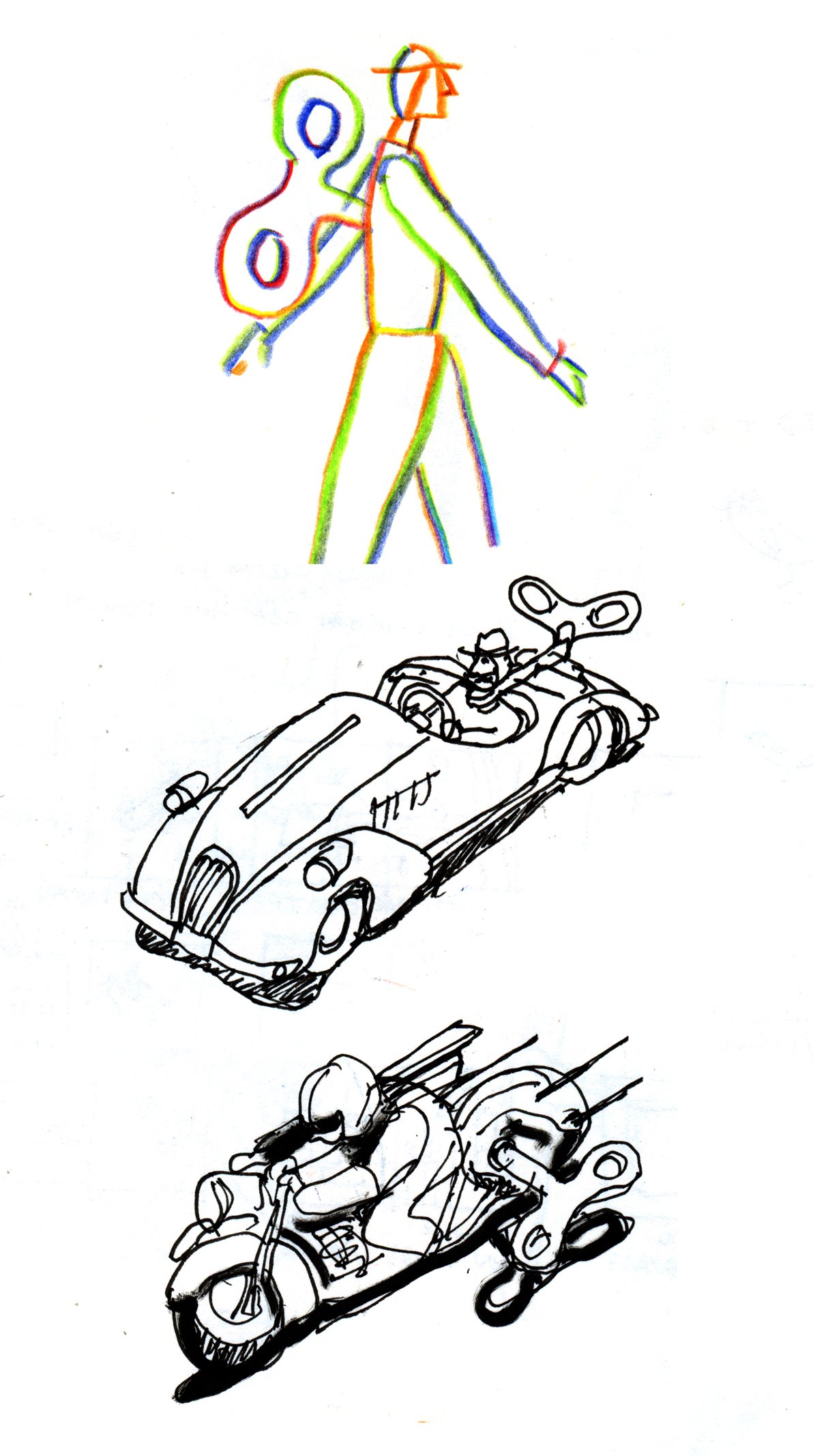
Seeing a hot air balloon being filled on an early morning felt better. A pre-wind moment so to speak. —cc
I knew blowing “wind” was going to be hard to depict so went to the verb wīnd. I sketched a wind-up guy but thought better to honor the vintage toys. I found a motorcycle and drew it in the style that it was painted on the tin toy. I added the “whiz lines” and got two-for-one! —cf
24Wood


I didn’t want to be too obvious with my selection. I basically walked around aimlessly in my neighborhood until I found these spoons. I then created a pattern. So this is design first, wood second. —cc
Pencils usually get credit for their graphite when they are actually about 75% wood. I love what happens when you sharpen a pencil, especially with an old hand-held sharpener. I was going to just draw the shaving but decided to pay homage to Craig’s photograph 11/52 paper. —cf
23Time


NOTE: Both of us created two versions of this one not knowing each other had done the same. At our weekly ‘show and tell,’ we decided they all made the cut and people deserved to see them.


I had so much fun with this one. I photographed the hour glass first and thought I was finished but I later came up with the idea of clockface and couldn’t decide which one I liked better. I always tell students to pick a lane and stand by it and I clearly couldn’t practice what I preached. —cc
Time is abstract and is usually associated with timekeepers—watches and clocks. I thought of “the burden of time” and its weight on all of us. The hourglass is perhaps the most incredible graphic because of it’s simplicity and opportunity to interpret. —cf
22Hot


I started with a hotplate and ended up with red peppers. I am not sure why. —cc
The ultimate hot symbol is fire and since Craig had already photographed burning matches (16.Light), I decided to use his photo as reference for a colored pencil drawing. I intentionally broke the gradated flame into a few distinct color bands—a little graphic exercise. —cf
21Small

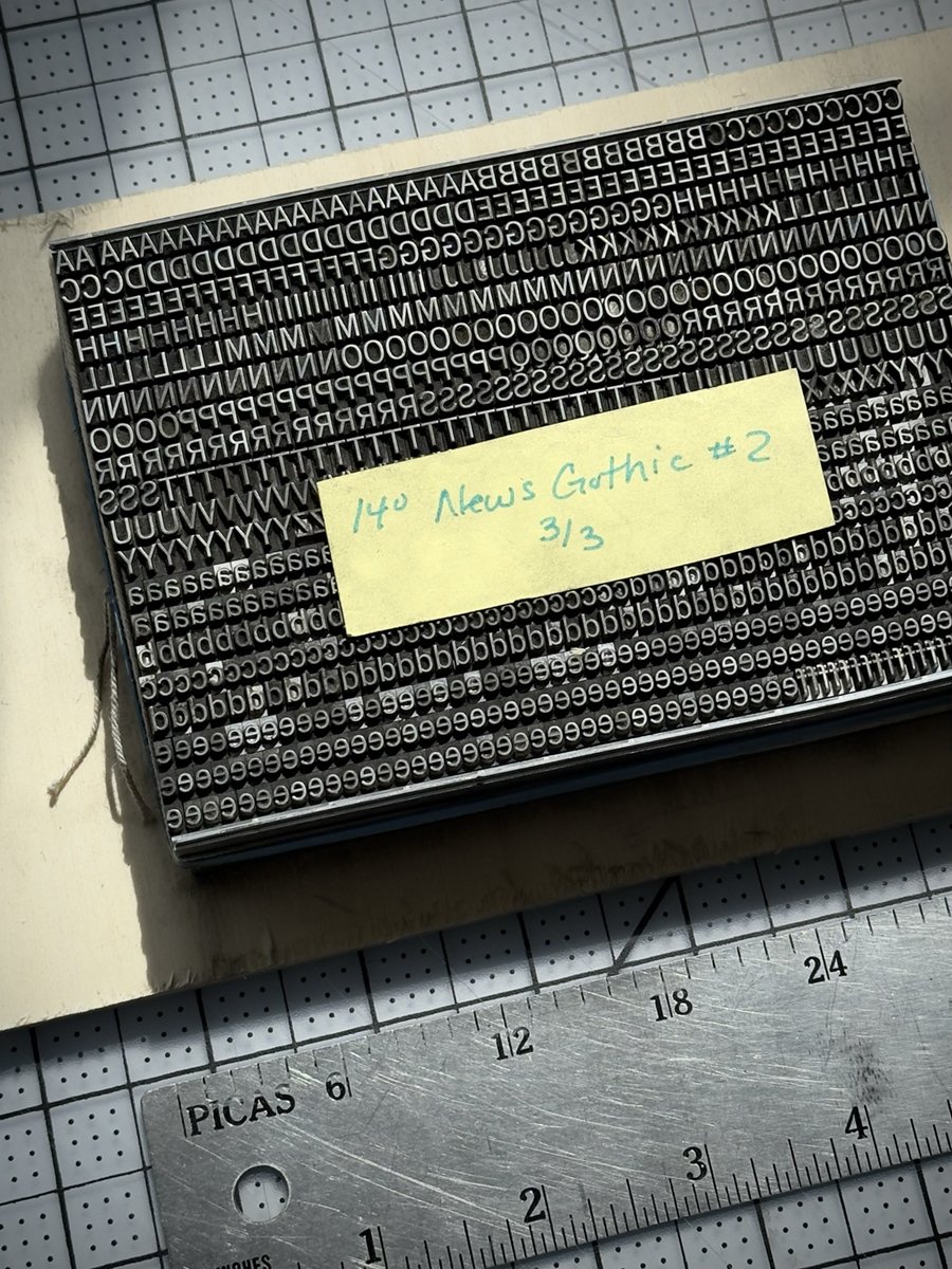
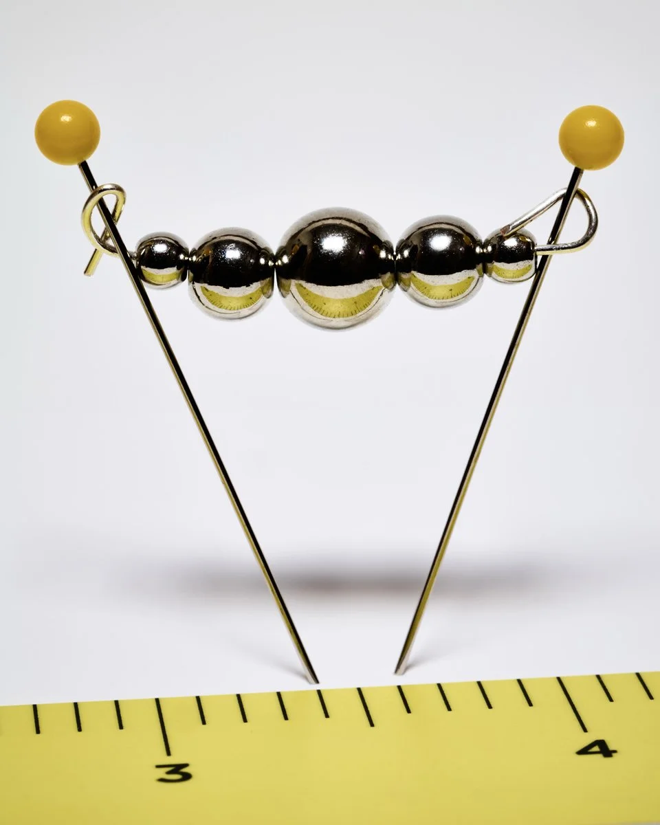


My first idea was to create a very small sculpture that would be about an inch square. Tiny spheres became my sculptures focal point and pins became my flagpoles. I got bored with this idea and like a client with too much time, I decided to move on to a wall of 14-point News Gothic lead type. —cc
Something is only small in relation to something larger—scale. If I wanted the figure to be small, I needed to diminish it in relation to its environment. After I designed the scene, I decided to ‘slow’ the read of it by making a mask of jellybean portholes through which to view it. I cut several of these out of paper to arrive at the best color combination. —cf
20Angle


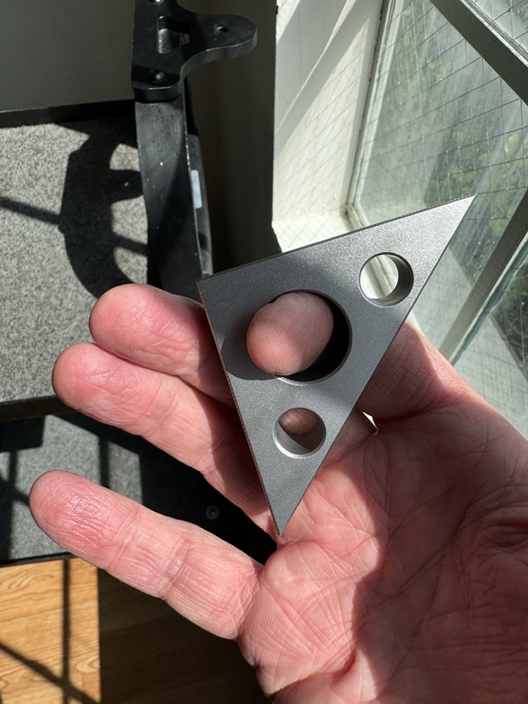

My inspiration for this week’s word came from German photographer Peter Keetman’s 1953 book, “Volkswagen: A Week at the Factory.” His photographs of perfectly stacked raw sheet metal still holds up today. My little metal triangle photograph was created in honor of his work.—cc
I have dozens of 30/60 and 45 degree triangles all over my studio—they are essential tools. The 45 is the most universal and visually perfect. It’s got a 90 and a 45 angle. I didn’t want to draw a triangle, I wanted to draw it’s effect. —cf
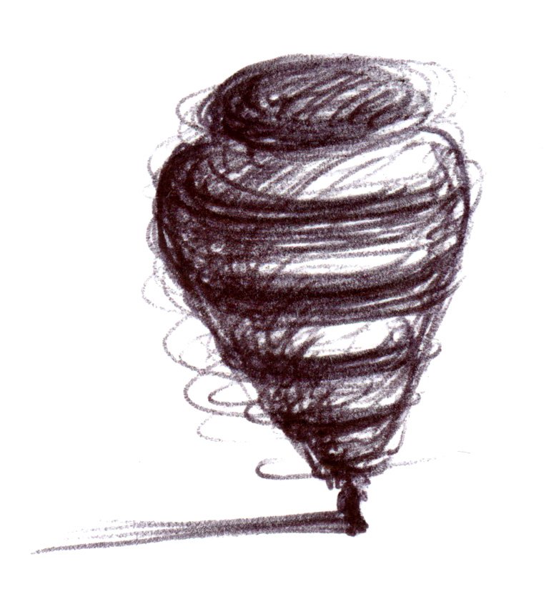
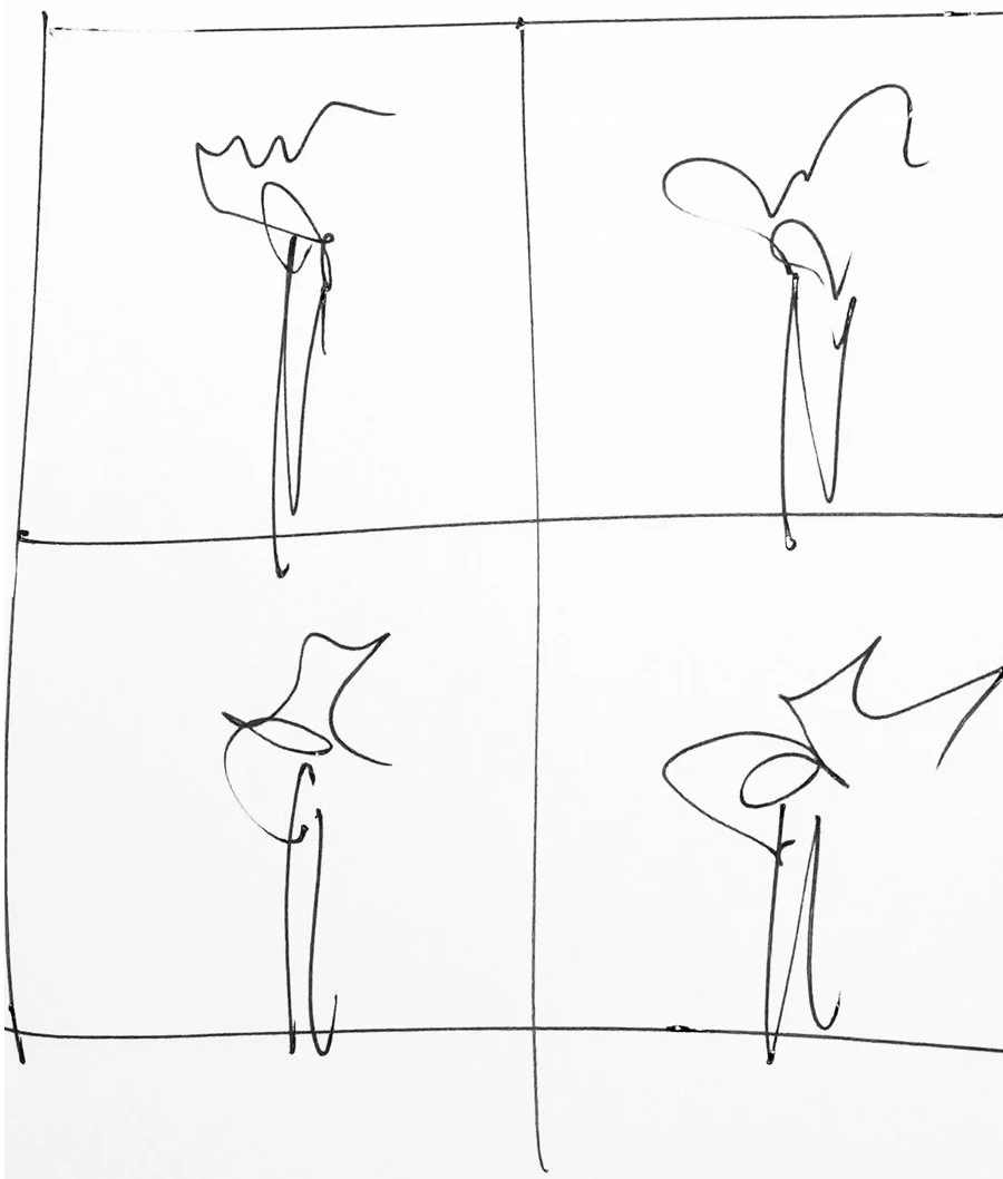
19Spin


I scouted this location three times this week but today the clouds finally came in and I knew it would be a good session. I wanted to get out of the studio for this word and I was going for a majestic landscape. I was thinking about the late great photographer Bill Brandt. Nobody was better than he was in creating an amazing B&W contrasty landscape. —cc
I couldn’t resist riffing on Craig’s spinning top in his ‘balance’ photo. After drawing the little graphic top, I realized that it felt static—not spinning. So I made it into a diagram by adding a little cut paper arrow. —cf
18Coffee


One of my favorite books showcases the commercial work of the great Czech photographer Josef Sudek. He created this work between 1920 - 1930 and was inspirational for this week’s word. It was important for me to create this image in one shot. —cc
It wouldn’t be honest if I didn’t explore the cup. I love drawing a cup. But what says coffee first thing in the morning is our Bialetti coffee maker—and the smell. It’s a gorgeous object and gorgeous to draw. I first did a very graphic, almost Lichtenstein version, then a colored pencil line drawing—both left too much information and nuance unexplained. So I settled on a simple graphite rendering—done quickly. —cf
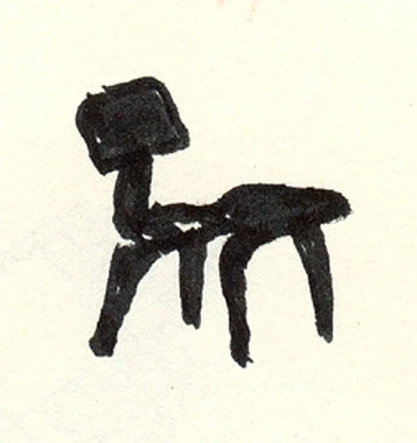
17Chair


The only thing that could make a Hans Wegner Papa Bear chair look even better would be a Vizsla.
Backyard shoot. Had to do it early before the sun popped. Hauled the chair out of our living room. They aren’t light. —cc
You can draw a chair with three lines—the challenge is making the lines interesting. —cf
16Light


No two matches create the same flame pattern when ignited. I thought a four panel grid would be a great way to show just how unique each flame really was. I used the frame burst mode on my Leica SL2 to capture that split second moment.
—cc
I chose two meanings of the word: the reference to weight, or lack of, and with light, you always have shadow.
—cf
15Stretch


I could not help myself. I had a childhood flashback on this word. I like Gumby damn it! I received a few disturbing stares from passengers on my plane while retouching the image.
—cc
A lot of things stretch but a rubber band is the perfect object of stretch—that is when it’s stretched. I set up a still life with objects on my desk and drew it.
—cf
14Layered


My first idea went back to my childhood creating layered spin art. I had fun doing it but it was not good enough for the diptych.
The layered onion was my second idea which to me was the perfect solution without trying too hard. Keep it simple.
—cc
I was planning on drawing the layers of a perfect hamburger until I came across a treasure of a beach stone—presenting the layers of time. The split drawing creates a certain technical quality that I find interesting.
—cf
13Fork


I was trying not to take each word too seriously when I came up with this one. The key was to find a three prong fork and not a four.
—cc
I’m drawn to seeing things in an alternative view. In profile, a fork is virtually unrecognizable—unless it casts a shadow.
—cf
12Glass


I went with my first idea which was to create a backlit glass sculpture. I probably constructed it 10 different ways before finally landing on this one.
—cc
I knew I had to stay away from trying to accurately portray glass, knowing what Craig would likely do. This idea came to me watching the Brian Eno documentary. I didn’t sketch it, went right to the finished drawing.
—cf
11Paper


This one could have gone many different directions for me but I always visualized in my head a crumbled up piece of paper. The pencil became the podium.
—cc
How do you make paper interesting? The answer is what the paper makes. The crane was so much fun to draw!
—cf
10Wavy


I drive along the northern coast of California all the time and therefore thought it would be a crime not to photograph its waves for “wavy”.
—cc
Adjectives are the hardest! I had to resist the ocean though I pondered it. it occurred to me that the familiar wavy line must be drawn with a wavy pencil. —cf
9Contain


My first idea was to photograph a goldfish in a bag but I couldn’t figure out what to do with the fish after the shoot. This lead me to my second idea of pool balls. Contained typography…what’s not to like. —cc
I liked a goldfish bowl but it felt like a daunting drawing to take on. I placed newly harvested tomato in a bowl that was sitting on the counter. Contained tomato! It was so graphically pleasing—perfect for cutting out of paper. Homage to the Marimeko designed bowl. —cf
8Round


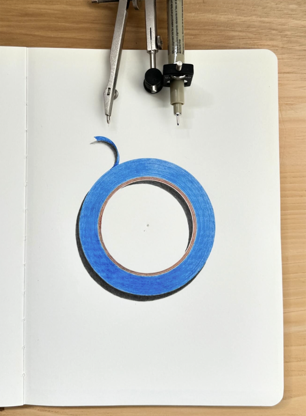
I could only think about Irving Penn’s amazing caviar photographs for Vogue Magazine. —cc
Everything’s round, this was hard. 25 rotations with a compass holding a blue Micron 01, add a little colored pencil and done. It’s a beautiful object. I left the compass holes for proof. —cf
7Fly


Our workspaces for ‘fly’.
Fly was the perfect challenge. Craig C. did the verb and I did the noun. I eliminated the glove and added the cloud—thank god.
—cf
There is a little island between traffic that lines up perfectly with landing jets at LAX. You couldn’t ask for a better location to shoot airplanes. I rewarded myself with a In & Out burger walking distance from the location which made for a very good day. —cc


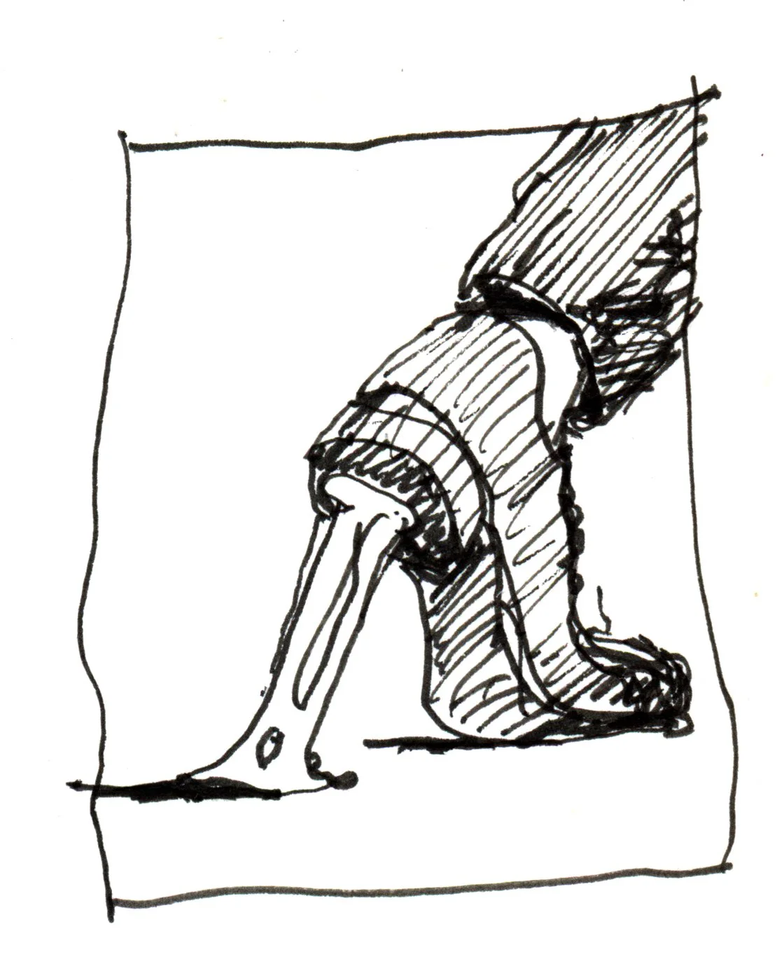
6Balance

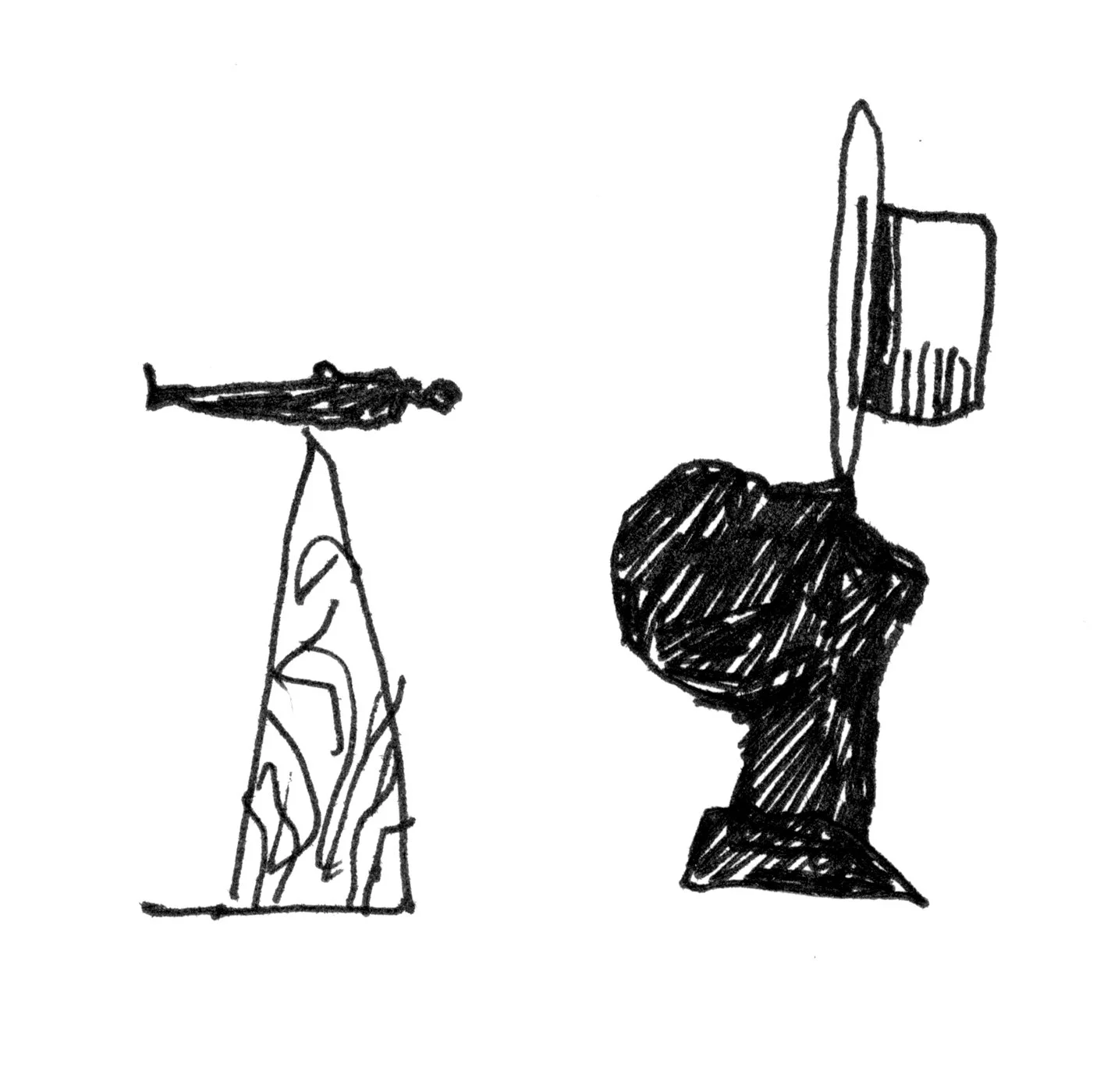

Yes, that was a real spinning top. This set came crashing down more times than it balanced. The real balancing act was spinning the top and pulling the shutter before it collapsed.—cc
Balance afforded a lot of possibilities. I landed on this little graphic figure using a multi-color balance pole. He’s symmetrical and in balance, his outfit isn’t. —cf

5Green

I could not resist shooting something natural. I visited my favorite florist just a block from my studio who happened to cut one stem too short on a beautiful leaf. I knew then I had found my shot. —cc
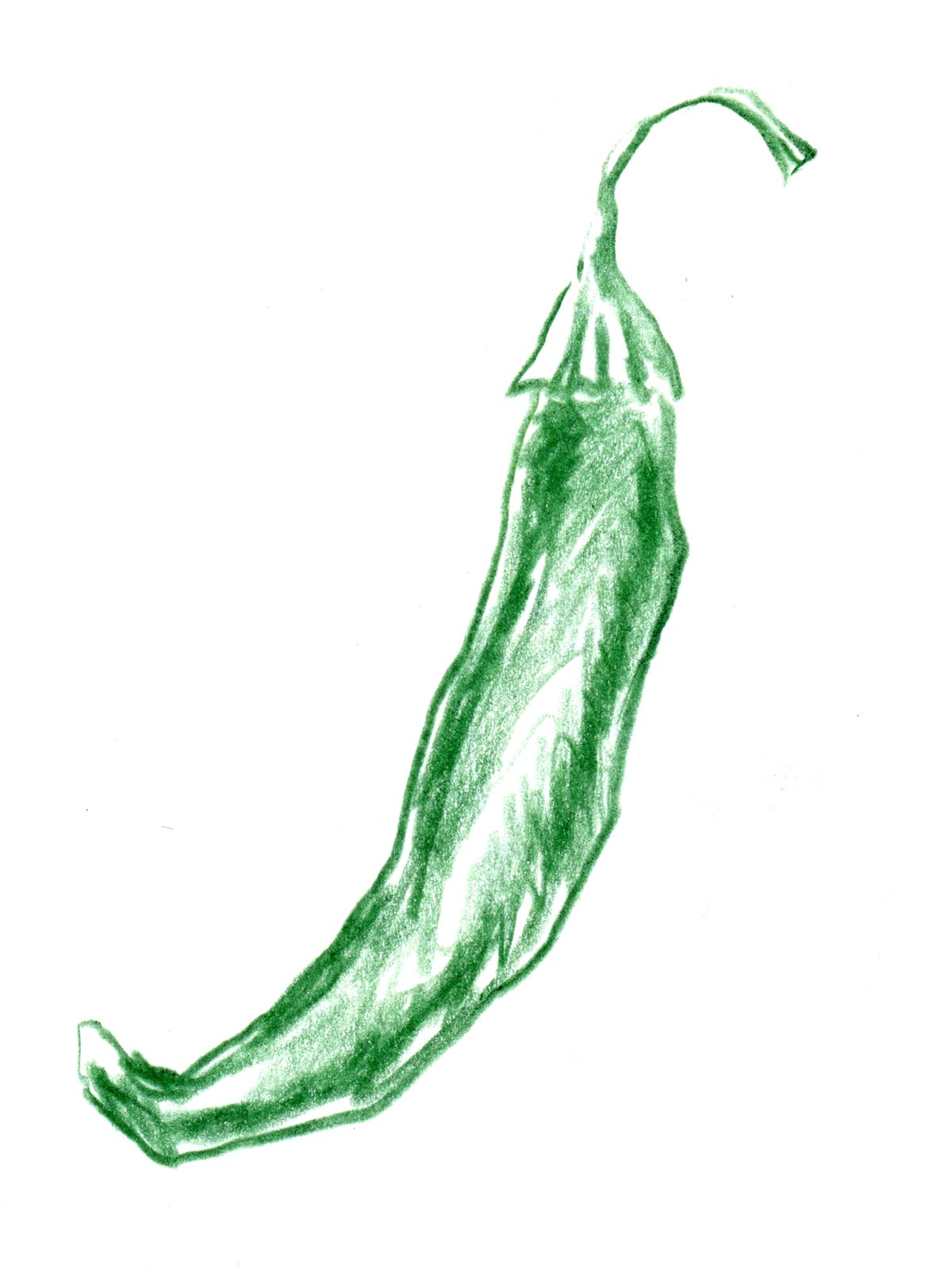
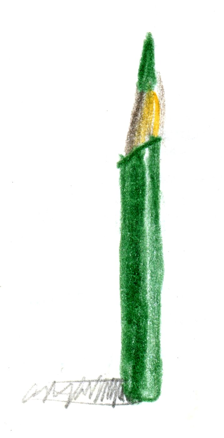
Couldn’t resist nature’s green. Abandoned a green serrano pepper because it was too limiting. I decided to make a green composition—a testament to the possibilities. Drew the lime and the pencil and stuck down a real PMS chip. —cf

4Pattern

I made 30 waffles to get the right color and texture for this shot. My hat’s off to all the great food stylist…it’s not easy at all.
—cc
I had initially thought of drawing a wheat chex after I observed the pattern at breakfast. After drawing a boring perfect repeating pattern I thought of the imperfect patterns in nature, thus the feather.
—cf

3String


I love the contrast of a line and an object. Craig’s egg in 1Screw was the perfect inspiration. A fun graphite drawing. —cf
2Liquid


Capturing liquid in motion never gets old when you can freeze it at 1/80,000 of a second. It allows for endless surprises that the human eye cannot see. —cc
Really tough one to draw. Water is hard to see, it’s what we see through it that defines it. I put drop of water on a red Bodoni A and challenged myself to draw it with prismacolor pencils. —cf
1Screw


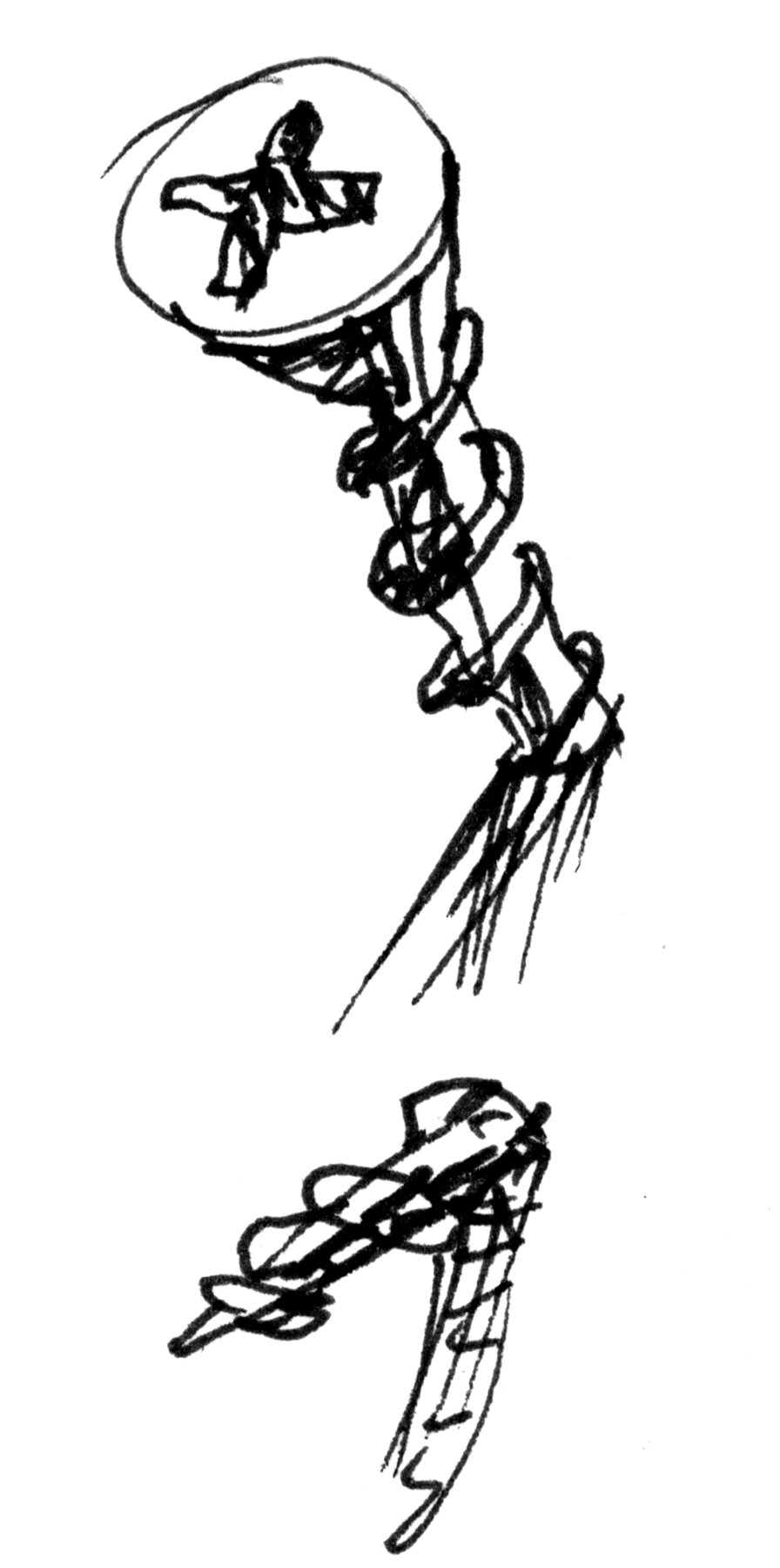
More often than not, I find the concept and sketching process much more fun than taking the photograph. —cc
Our first word—a noun or a verb? No need to be clever here, just try to faithfully draw a wood screw. Graphite is perfect for rendering metal. —cf
